Human-Centered Design Process
We design products that work the way people work.
At Gomoll Research + Design, our five-stage process begins as we Discover user needs through contextual research of user behavior. We then Analyze the results, providing direction and rationale for our Design concepts. Sharing designs with users tells us where we can iterate and Refine solutions, before we hand off blueprints to the team that will Implement the final product.
Each phase may overlap, so we can be responsive to all aspects of the work, careful to incorporate user feedback in the most meaningful ways.
What is Humanistic Design?
We place the person at the center of the design process, slowing down and looking at what we learn when we observe and listen. Our design expertise comes into play only after we walk in the shoes of the people who will use our designs.
discover
Experience Research, User Goals, Personas, Contextual Observations, Interviews + Surveys, Competitive Analysis, Technology Trending.
We are all technology users. At GRD, we specialize in research methodologies that put our personal preferences and experiences aside, to reveal how others view and interact with their tools, mentally and emotionally. We make the effort to stay curious, and our accumulated knowledge helps us recognize patterns, analyze deep problems, and objectively study the core of the users’ experience.
Observation and research out in the field leads to recommendations for viable, forgiving products. Involving and educating each client team helps give our recommendations staying power. Our clients rely on our ability to remain open to discovering what’s possible for their current needs and what’s ideal for their challenges in the future.
Kate and Tom Gomoll began their careers at Apple in the 1980s, on the team of the cognitive scientists, field researchers, and product designers who developed this user-friendly approach. They’ve been among the experts since the start, and they have passed that pedigree onto their employees and their clients.
Analyze
Task Analysis, Workflow Modeling, Storyboards, Usability Benchmarks, Human Factors Analysis, UX Strategy.
After gathering quantitative and qualitative information from a few users – or a few dozen users – the puzzle pieces start to fit together. Vigorous notes, on-site sketches, recordings, and other artifacts are organized to tell a compelling story about the people and their processes. When we relate to authentic characters in an interesting story, we can then create change.
Our analysis process has strong grounding in communication and collaboration. We work internally and with client subject matter experts to make sure key details are given clear attention. The analysis helps establish a hierarchy of user needs, so that we are designing solutions for the critical tasks first and ancillary tasks second.
All analysis considers established best practices, new technology trends, and recent human factors research so that we can create an extensible plan over the coming months or years.
Design
Information Architecture, Wireframes, Creative Concepting, Interactive Design, Visual Design, Content + Writing, Mockups.
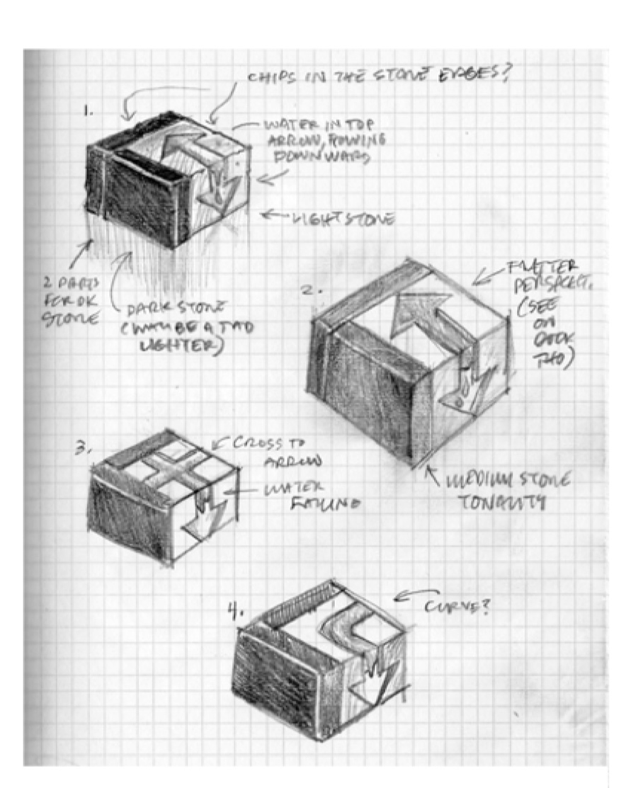
A pencil sketch can be the springboard for the most creative ideas, a way of thinking and discerning, digging out a concept from a pile or research, committing to exploration before committing to design. It’s an essential tool for separating humane qualities from transient trends. Sketching allows us the freedom to discard what won’t work at the start of the process, fueling a fresh perspective and leading us to the best concepts.
After conceptual sketches, we create simple, un-styled wireframes that allow us to ask more questions to help refine the organization of content and the trustworthiness of interactions, often getting valuable feedback from users at this stage. Once their feedback is incorporated into the design, a detailed touch of visual design is applied.
Our designers have many decades of expertise in natural perception and behavior research, not just the beauty of brilliant design and the value of functionality. We want to see what drives how people think and feel. We want all the pixels to become a final design that affirms the users’ stories, and stands the test of time.
Refine
Rapid Prototyping, Usability Studies, Iterative Design, Data Visualization, Iconography.
In the early days of HCI, (Human-Computer Interaction), Tom Gomoll co-founded Apple’s first usability team. At GRD, the practices and philosophy of putting the user at the center of the design process still hold true.
To refine a design, we ask users to perform specific tasks with a prototype, allowing the real experts to speak. They find the spots where the design isn’t helping them reach their goals. Iterating upon the design and again re-engaging the users for their response often resolves problems more quickly than other methods. Usability studies pave the way to the best user experience because the users make valuable contributions to the design process.
The deeper subtleties of design details can now be given attention, after the core of the experience is locked down: visualizing information and graphical content, creating icon libraries that support a common vocabulary, and solidifying the value of a brand.
Implement
Style Guidelines, Development, User Validation.
The designs are made real in collaboration with each client’s unique development environment. From the start, we create designs with expectations around a platform’s possibilities. In some cases, we evaluate options and strategize what development direction would best support the users’ experience.
When the design is complete, we publish the details required to build both interactive prototypes and final production products. Our style guidelines are thoughtfully organized to create extensible applications. With a library of individual screens, palettes, layout maps, controls, icons, and behavior descriptions, a new feature or screen of content can be built with ease, using the existing structure and parameters to ensure consistency with the core design.
When needed, we partner with software specialists to create the initial working prototype. This serves as the baseline measurement tool for testing and validating groups of user behaviors and for gathering rapid feedback for design revisions before full implementation.


